
What do readers see? For most of the past half millennia, the answer has been straightforward: readers see rectangles, both visible and invisible. From the obvious orthogonality of the codex, the page-opening, and of course the page itself to the unseen boxes that frame the printed letters and lines, rectangularity is fundamental to our concept of the book as an object. Of course, rectangularity isn’t peculiar to print: manuscript books were rectangular too as is much of the man-made world, from bricks to beds, from doors to windows, from bank-cards to laptops. But the rectangle is integral to print because, for centuries, every page, every line, every word was made up of small rectangular pieces of type.
These bookish rectangles are rarely considered by readers—apart, perhaps, when we are packing books in boxes or shelving them in bookcases—but they shape our reading practices. Our expectations about textual orientation, about where a page starts and where it ends, and about the placement of illustrations, captions, footnotes, marginalia, and even page numbers and punctuation have all been determined by these rectangular practices, even though the vast majority of books we read now are not set using rectangular type. Text knows its place on the page, and we have been taught where to find it.
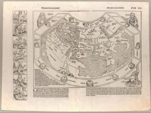
Printers, of course, have always been aware of these rectangles, and how these perpendicular parameters define the work they do. This is not to say that printed layouts had to be uniform or predictable: see, for example, the range of complicated layouts used in the Nuremberg Chronicle of 1493 or the vertically oriented text in George Herbert’s “Easter Wings” poem. But in each case, the rectangle provided the invisible and visible frames.
Authors rarely print themselves. In the traditional canon of English literature, only a small handful of authors have been trained printers. The most successful English author-printer was Samuel Richardson (1689-1761). By the time he began writing in earnest—his first novel, Pamela, was published in 1740—he’d been a printer for decades. Like many a modern publisher, Richardson was attracted to the book trade because he was an avid reader as a young person but years of working in the printing house changed how he read; “I seldom read but as a Printer” he confessed in a letter. He saw the rectangles.
Richardson’s most famous novel, Clarissa, focused on a young woman, Clarissa Harlowe, whose tyrannnical family attempt to force her to marry a man she finds morally, intellectually, and physically repugnant. She finds herself seeking the help of an aristocratic libertine, Robert Lovelace, whose motives are, to say the least, sinister. He tricks her into fleeing from her family and lodges her at a London brothel; she is coerced, threatened, assaulted, drugged, and raped. That she pieces herself back together emotionally and psychologically testifies to her extraordinary resilience; however, the novel—or more correctly, eighteenth-century society—presents her with a very dismal future so she gently, but purposefully, declines towards a redemptive and serene death.
The novel was a sensation when it was published. It was also the longest novel of its time, published first in seven and, in a revised form, eight volumes, each about the size and heft of what we would now consider a regular paperback. Richardson, a pioneer of the novel as a genre, understood precisely the importance of the book’s material form. Moreover, the whole novel is constructed from letters written by Clarissa, Lovelace, and a host of other characters, and alongside regular references to ink, paper, seals, messengers, and the postal service, Richardson occasionally uses typographical features to mimic the handwritten nature of the letters themselves, such as a calligraphic typeface to indicate a signature or a series of manicules (or pointing fingers) to represent the furious annotations that Lovelace makes in the margins of a letter he intercepts from Clarissa’s best friend.
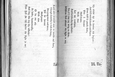
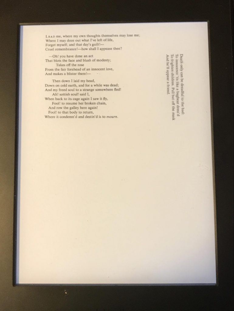
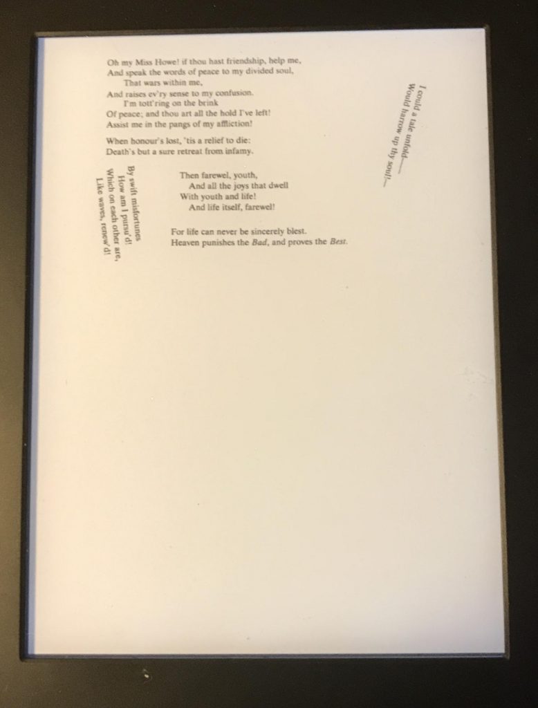
None of these, though, are quite as dramatic as the typographical layout that Richardson uses to reflect Clarissa’s emotional and psychological breakdown in the aftermath of the rape. Lovelace reports that “what [Clarissa] writes she tears, and throws the paper in fragments under the table, either as not knowing what she does, or disliking it: then gets up, wrings her hands, weeps, and shifts her seat all around the room: then return to her table, sits down, and writes again . . .” One of these “papers” is a series of poetic fragments that Richardson lays out across the page as torn-up text:
What’s remarkable about this page is that it defies the expected rectangularity: alongside the usual perpendicular layout are lines that are aslant, literally disorienting the reading experience. For Richardson the printer-author, the trauma of rape—its violation, its irrationality, its unspeakability—is represented by a breakdown of typographical order, a violent disruption of the rational and bounded textual space. As one of my students brilliantly observed in a classroom discussion, there are striking similarities between this page and Picasso’s “Weeping Woman.”
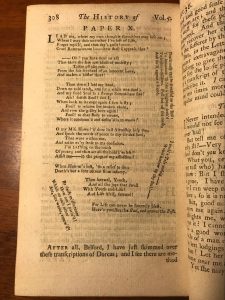
Later editions of Clarissa have struggled to capture the acuity of Richardson’s printer’s eye. The standard modern edition of Clarissa—the edition that the English students at Bath Spa read as part of their compulsory second-year course—is the Penguin edition, first published in 1985. It is, I’m afraid to say, a bibliographical grotesque. By deciding to squeeze the whole book into a single volume (as if modern readers could not face the idea of reading a seven-volume series), Penguin stretched its physical form to a near-breaking point: the volume is taller, wider, and heavier than any other Penguin paperback and, as every one of my students knows, sustained reading invariably leads to the book falling apart. It is barely portable, impossible to read comfortably in chair or in bed, and Ryanair once stopped a student from travelling with it because they considered the novel to be a piece of a hand-luggage. Moreover, the book’s dimensions are disproportionate in comparison with a usual paperback, and the line-length is nearly twice as long as we’re comfortable with. We are used to novels as friendly companions; the Penguin Clarissa is an oppressive burden. As I tell my students, it is literally a very difficult book to read. It is definitely not the reading experience that Richardson had in mind.
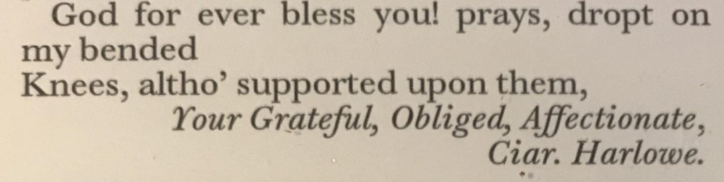
Not surprisingly perhaps, every year some of my students choose the Kindle edition of the Penguin instead. The book is transformed: practically weightless, it can be reconfigured by the reader with ease. Layout, margins, line-spaces, typeface, type-size, even colour can be determined by the reader. However, the electronic text—evidently an OCR version of the print edition—struggles when it encounters those passages of typographical ingenuity, mistranscribing the words set in calligraphic typeface, scattering manicules, and rendering the torn-up paper as a sequence of broken images:
Clarissa, like the vast majority of written literature in the West, lives in a world of rectangles, whether those in an eighteenth-century book, a Penguin classic, or a Kindle. But the similarity of visible rectangle—that of the page—should not lead us to forget that the invisible rectangles matter too. In the novel, Clarissa flees the oppressive tyranny of her family only to be torn apart by a self-obsessed libertine. There is an irony that Richardson’s achievement as a printer-author has, over the last thirty or so years, suffered the same fate: first to have been suffocated and trapped inside a volume that makes, literally, no concessions to the reader, only to be liberated by a technology that privileges the reader’s whims over the decisions of its author-printer.
Ambient literature isn’t rectangular in the same way that Clarissa was: indeed, in a real sense, it directly engages with the world beyond the perpendicular text. However, in the case of the three works written for the Ambient Literature project, the rectangle—that of a smartphone’s screen—remains at the heart of the piece. As Richardson understood so well 250 years ago, a reader of ambient literature needs both direction and discretion, to be given a text whose material form can accommodate their own physical disposition and location while still providing a bounded experience. Each of these new works plays with the rectangle of the screen in remarkable, innovative, and engaging ways, but they also ask the reader to respect the text’s material form. Ambient literature makes its authors write with a printer’s eye.
—Ian Gadd


